Critical Thinking
Lesson 3: Apply the Information
to save your progress
Objectives:
- Educators will be able to explain how information can be misinterpreted.
- Educators will be able to compare costs and benefits when making decisions.
- Educators will be able to explain that decision making is an abstract process without true right or wrong answers.
Objectives
- Educators will be able to explain how information can be misinterpreted.
- Educators will be able to compare costs and benefits when making decisions.
- Educators will be able to explain that decision making is an abstract process without true right or wrong answers.
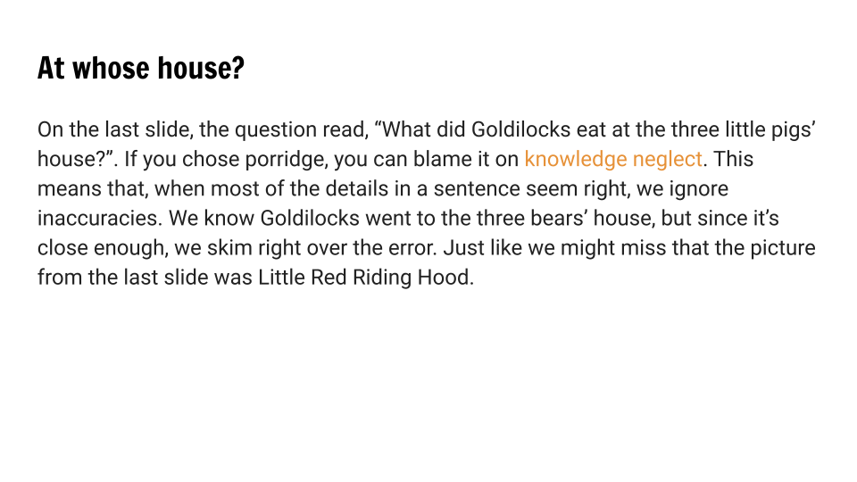
In the first two modules of this course, we talked about finding strong sources we can trust, but as we become better critical thinkers, we have to be skeptical of our own interpretations of information in addition to the information itself. In this module we’re going to start thinking about heuristics, or mental shortcuts, and how they can lead to bias.
This can be the hardest part of critical thinking to teach. It's easy to believe other people are trying to trick us, but it's tough to see the flaws in our own logic. As you approach the topic with your students, remind them that everyone's brain is susceptible to cognitive bias. It doesn't matter how smart you are, you have to be aware.
How does the word bias make you feel? How do you think it might make your students feel?
Even though the concept of bias sometimes invokes negative emotions, everyone has biases. They come from shortcuts that help us make decisions under pressure by allowing us to quickly make predictions based on previously observed patterns. These shortcuts, or heuristics, helped early humans decide what was safe and what they needed to be cautious of. But while heuristics were often helpful for cave-people, they aren’t guaranteed to work.
The Chimpanzee Test
Heuristics are constantly in action, shaping our everyday behavior. If we had to think through every decision we made in a day, it would be exhausting. Heuristics allow us to function with a much lower level of cognitive effort. They allow us to connect our past experiences to new scenarios. But as we become better critical thinkers, we have to be conscious that, while heuristics take away the burden of constant decision making, they can cause a tendency to overgeneralize.
The activity below is based on an experiment that was performed by Hans Rosling at the Karolinska Institute in Stockholm. Try the activity, then, answer the questions below.
How did you do?
Did you get more than 4 questions right? Most people don't.
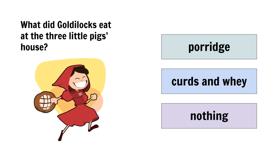
This was an actual experiment performed by the late Hans Rosling. He gave thousands of people the test you just took. He compared the results to the idea of having a chimpanzee choose between three bananas. The chimpanzees should average a score of 33% based on random selection. The people who took the quiz only averaged 15% correct.
What does this tell us?
Chimpanzees don’t really know more about the world than people do. In fact, people have a lot of ideas about the world. That’s why they get the answers incorrect.
Preconceived ideas about the state of the world influence the choices people make in the quiz, leading to incorrect assumptions.
Cognitive Biases
Knowledge neglect is far from the only type of cognitive bias - Wikipedia has over 200 types on their list, although some are more common than others. In the slide deck below, explore a few common cognitive biases.


Use the link below to complete a webquest about more cognitive biases.
How do you think businesses use cognitive biases in their advertising? Can you think of a specific example?
Deceptive Data Displays
Deceptive data displays take advantage of the tendency of our brain to look for patterns instead of considering every detail. While graphs and charts can be great for visualizing abstract data, they can be easily manipulated to support specific arguments. Learn about three common ways data can be manipulated using data displays below.
1. By truncating the axis
It is easy to manipulate a data display by truncating, or shortening, the y-axis on a graph. This can make discrepancies look much more or much less significant. Below, both line graphs show the same set of test scores, but they look very different. In the incorrect graph, the y-axis is truncated, or shortened, to jump from 0% to 80%. The truncated y-axis makes trends appear much more significant. Would you consider it a huge drop to go from a 92% on a test to an 80%? The incorrect graph makes it look like one. It is much more accurate to show the data on a graph with a full axis.
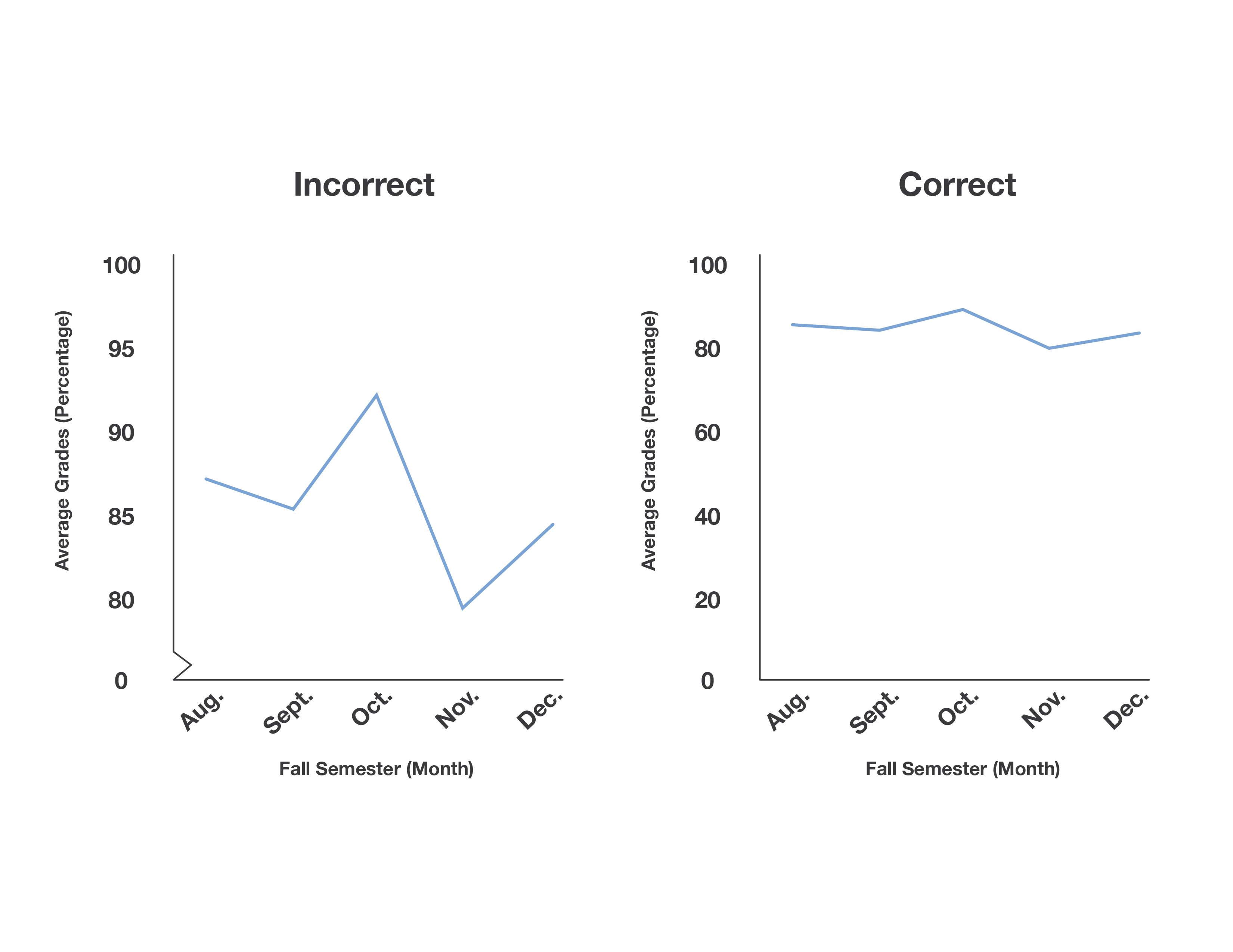
Always check the axes when you’re looking at a graph. Be especially skeptical of any graph that skips a large section of numbers.
2. By playing with proportion and scale
When showing relationships between elements in data displays, the area of each element should always be proportional to the data it represents. This is especially important in graphs and charts that show information as shapes rather than standardized lines or bars, like the bubble chart below.
It can be tricky for us to interpret proportion visually, but looking at the incorrect chart, how many times bigger do you think the Raleigh circle is compared to the Fayetteville circle? While the population is roughly double, in the chart, the blue circle itself is four times the size of the purple one, which does not accurately reflect the data. By ensuring that the areas of the circles are proportional, rather than just the diameters, data can be displayed more accurately in charts and graphs.
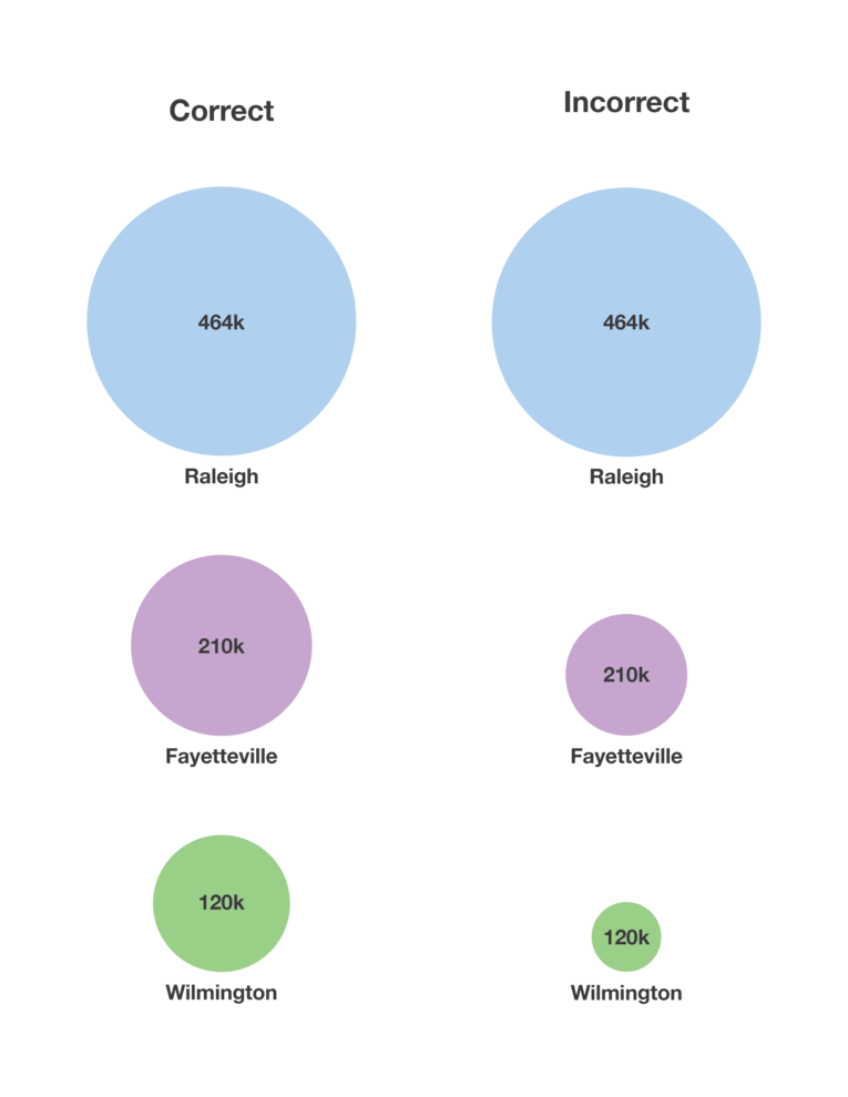
Make sure you compare 2D shapes using 2D measurements.
3. By making unrelated variables seem causal
Just because two data sets appear to be related doesn’t mean they actually are. Be wary of visuals that show relationships between two seemingly unrelated variables. Could there be another cause for the correlation?
In the example below, the graph shows a relationship between the cost per gallon of gas and the number of cups of coffee sold daily at a roadside cafe. When graphed on the same scatter plot, they show a positive linear correlation, indicating that as one increases, so does the other. But the way the variables are plotted, the chart implies that coffee sales are dependent on gas prices.
It doesn’t make sense to claim that increasing gas prices cause coffee sales to increase - here, both variables are dependent on another factor called a confounding variable. The confounding variable in this case has to do with an increasing rate of car travel. As more people travel by car, the demand for fuel causes an increase in gas prices. The travelers are also more likely to stop for coffee, as there are more of them. Since both variables in our graph rely on the confounding variable here, they show correlation without causation, meaning they follow the same pattern but aren’t dependent on each other.
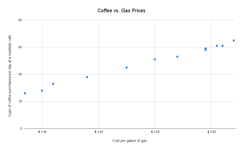
When looking at seemingly related variables, consider an underlying cause.
Cognitive Ease
Some things are more believable than others. Because we are pattern-seeking beings, new information that fits an existing pattern is easier for us to accept. Psychologists use the term cognitive ease to describe how easy or difficult something is to believe.
Consider the two statements below. Which do you think is true?:
Canberra is the capital of Australia.
Sydney is the capital of Australia.
While Canberra is technically the capital of Australia, you may have had an easier time believing that it was Sydney. When faced with two possibilities, we tend to rely on familiar details that fit our prior knowledge. In this case, most people probably recognize Sydney as a city in Australia. Canberra, much smaller than Sydney, isn’t as widely known. Because we associate Sydney as a city in Australia, it’s a short jump to believe that it’s also the capital. Without knowing that Canberra is also a major Australian city, accepting it as the capital provides a lower level of cognitive ease.
In cases like this, critical thinking is especially important. We’re more susceptible to fall for falsehoods and cognitive biases when we’re familiar with part of the information, not when it’s all new to us. Just because something seems accurate doesn’t mean we can or should immediately trust it.
There are plenty of commonly believed facts that actually aren’t true. For example, cracking your knuckles won’t give you arthritis and a penny dropped from the Empire State Building won’t actually kill anyone standing below. Why do you think these “facts” have such a high level of cognitive ease?
Teacher Resources
to save your progress